
Loading…
Loading…
Design that's more than beautiful — research-led interfaces that turn visitors into customers and software your team actually wants to open on Monday morning.
Free, no-obligation consult — just a real person.
Official ERPNext Partner
In business since 2011 · 200+ clients
You spent months and a real budget on a new app, portal or dashboard. It launched. And then... adoption stalled. Staff quietly drifted back to spreadsheets and WhatsApp. Customers bounced off the signup form. The board asks why usage is flat and nobody has a clean answer.
Here's the uncomfortable truth: that's almost never a software problem. It's a design problem. When an interface fights how people actually work — too many clicks, confusing labels, screens crammed with fields nobody needs — humans do the rational thing and avoid it. No feature list survives a bad first five seconds.
Acube Innovations designs interfaces around how your real users think and work, so the product gets used — not admired in a demo and abandoned in production. And because we've designed and built web, mobile and ERP products since 2011, our designs are always practical to ship: not pretty mockups that fall apart the moment a developer opens them, but a working blueprint your build team can deliver pixel-for-pixel.
In business since
Clients served
ERP projects
Work by referral
You launched an app or system and adoption stalled — people went back to the old way.
Your website or product gets traffic but visitors don't convert or sign up.
Staff complain the software is "too complicated" and quietly create Excel workarounds.
Your ERP or dashboard is powerful but punishing — dense screens, too many clicks, training that never sticks.
Every screen looks slightly different because there's no design system, so the product feels untrustworthy.
You have wireframes and ideas but no team that can design AND build them without things getting lost in translation.
A designer gave you gorgeous mockups that turned out to be impossible (or ruinously expensive) to actually code. That last one is the trap most studios spring. Let's deal with it head-on.
Users decide in seconds whether to trust and engage, or give up. You don't get a second five seconds.
Software nobody uses is the most expensive shelfware you'll ever buy — the licence, the build cost and the change effort, all wasted.
Every removed step, ambiguous label and dead-end is a drop-off you're paying for in lost signups, carts and completed tasks.
A coherent, on-brand experience reinforces credibility on every screen — and credibility is what makes people click "Buy" or "Submit". > A beautiful screen that nobody can use is a failure with good lighting. We design for the one metric that pays your invoices: will people actually use this — and finish what they came to do?
(founder, product head, marketing head) who needs to ship a product that converts and grows — fast, on a modern stack, with a team that won't over-promise and under-deliver. Your win: a product users adopt and a funnel that turns clicks into customers.
who has to get an ERP, dashboard or field-force app adopted across the floor — and knows that if the team resents it, the whole investment dies. Your win: operations that stop fighting the software and start moving faster.
We design around real user behaviour through research and usability testing, so the product gets used instead of avoided.
Cleaner flows, clearer calls-to-action and fewer steps mean more completed signups, carts, enquiries and tasks — without spending more on acquisition.
Simplified, role-based screens turn a dreaded system into one people choose over the spreadsheet — which is where ERP and dashboard ROI actually lives.
Because the same company builds it, you get developer-ready specs and a component library — no "that's not technically possible" surprises after sign-off.
A reusable design system keeps every new screen and feature coherent as you scale, so the product never drifts into a patchwork.
Validated wireframes and prototypes catch the expensive mistakes before a line of code is written — rework avoided is budget saved.
understand the audience, context and jobs-to-be-done before a single pixel is drawn.
clickable prototypes you can click through and validate before development starts.
modern, on-brand UI with purposeful motion and micro-interactions that guide, not distract.
flawless across phone, tablet and desktop, designed mobile-first for India's traffic.
validate with real users, find the friction, and prioritise the highest-impact fixes.
reusable components and tokens that keep products consistent and fast to extend as they scale.
interfaces that work for everyone and load fast on real Indian networks and devices.
Most design studios can make a marketing site look nice. The genuinely hard part — the part most studios can't do — is making a complex business system easy: an ERP, a multi-role dashboard, a field-force app with dozens of interdependent workflows.
Because we implement ERPNext and build the web and mobile products ourselves, we know how to simplify dense, data-heavy screens so operations teams stop dreading the software. For a COO, that's the entire difference between a system the floor adopts on day one and one they resent and route around for months. We don't design in a vacuum and toss it over a wall — we design knowing exactly what it takes to build.
Want your ERP or app to feel obvious instead of overwhelming? Call +91 62358 66111 or WhatsApp us for a free UX review.
| Acube — design + build | Typical design-only studio | |
|---|---|---|
| Buildability | Specs and components engineered to ship | "Beautiful" mockups that break in code |
| Handoff gap | None — same team designs and develops | Lost in translation between studio and devs |
| Enterprise / ERP UX | Deep — we make complex systems simple | Mostly marketing sites and brochures |
| Design system | Reusable library your product reuses for years | One-off screens, no system |
| Measured on | Adoption, conversion, task completion | How the mockup looks in a review |
| After handoff | We build, test, ship and keep improving | Project ends at the PDF |
We dig into your goals, your users, their context and their real pain points — interviews, analytics, and where people currently drop off or work around the system.
Before any visuals, we structure the journeys and information architecture so every screen has a job and every step earns its place.
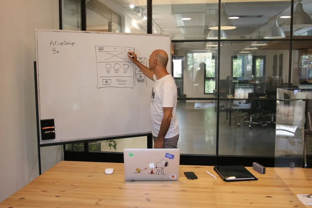
Low-fidelity, fast-to-change layouts that get the structure right before anyone argues about colours.
Clickable, testable, sign-off-ready prototypes — so you experience the product before it's expensive to change.
We observe actual people using it, find the friction, and refine. Catching a problem here costs minutes; catching it in production costs weeks.
On-brand, accessible, polished UI with a design system behind it.
Design-ready specs and a component library our own developers ship directly, so what you approved is exactly what launches.
Every month a poorly-designed product limps along, you're paying for it twice. Once in the sunk investment — the build, the licences, the change effort that nobody is benefiting from. And again in the opportunity cost: the signups your funnel leaks, the hours your team wastes on workarounds, the data quality that rots because people avoid the "official" system.
A redesign isn't a cosmetic expense — it's how you finally earn a return on software you've already paid for. Recovering even a fraction of stalled adoption or a few percentage points of conversion usually pays for the design work many times over. Doing nothing is the expensive option.
| Before — adoption stalled | After — designed for humans |
|---|---|
| Staff route around the system into Excel | Role-based screens people choose over the spreadsheet |
| High traffic, flat conversions | Cleaner flows that turn visitors into enquiries and customers |
| "Where do I click?" support tickets | Obvious, guided journeys that need no manual |
| Every screen looks and behaves differently | One consistent, trusted design system |
| Gorgeous mockups that never shipped right | Developer-ready design that launches as approved |
we design and build, so nothing is lost between mockup and product.
we make complex ERP, dashboard and business apps genuinely easy to use, not just consumer landing pages.
every decision answers one question: "will people actually use this, and finish the job?"
research, design, build and iterate under one roof, no finger-pointing between a studio and a dev shop.
in business since 2011, 200+ clients, and 70% of our work comes by referral because the results stick.
Our designers and developers are the same team — every design is engineered to ship.
Research and usability testing are built into the process, not skipped to save time.
Fixed scope, honest timeline, and we validate cheaply with prototypes before expensive development.
You own the design files, the system and the source. We earn the next project; we don't trap you.
Construction & EPC · Finance & Lending · Retail & Distribution · Real Estate & Property · Logistics & Transportation · Education · Technology & SaaS — plus startups and D2C brands designing products that have to convert.
Ready to make your product effortless? Book a free UX consultation →
Answer a few plain questions about how you work.
Case studies

BitSave (Casper Wealth Holdings Limited)
BitSave — A Secure Flutter Crypto-Investing App, Built to Launch Fast

Cochin Technical College
Cochin Technical College — Custom ERP Cut Admission Processing Time by Over 60%

Competitive Cracker
Competitive Cracker — A Flutter E-Learning App That Scaled to 100K+ Installs
Yes. We run a UX audit and usability testing, then prioritise high-impact fixes you can roll out incrementally — you don't have to start from scratch to get a meaningfully better experience.
Absolutely — it's a specialty. We design simplified, role-based workflows and dashboards on ERPNext so day-to-day users move faster, make fewer errors and actually adopt the system.
By outcomes — task completion, adoption rate, drop-off and conversion — not by how the mockup looked in a review. We agree the metric that matters to you up front.
Yes. Discovery and research are our first step exactly for this. We turn rough goals into validated flows, wireframes and a prototype you can react to before committing to a build.
All three. We design responsive, mobile-first experiences and platform-appropriate native app UX, with a shared design system so your brand stays consistent everywhere.
It depends on scope, but we work in fast, visible iterations — you'll see wireframes and a clickable prototype early, not weeks of silence. We agree a clear timeline and hold to it.
Yes. We design on-brand from the research phase and can build or extend a design system so every future screen stays consistent with your identity.
Get a clear plan, an honest timeline, and a fixed scope. Talk to a real expert today — whether or not you work with us.
or write to info@acube.co
Kochi (Kadavanthra & Infopark) · Thiruvananthapuram · across India & overseas · In business since 2011